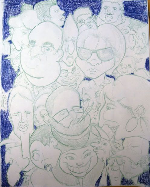
Okay, so here are some more coffee sessions over a period of 3 days. I'm noticing a good amount of improvement each day i draw, not that its a lot, but i at least can see and feel it.
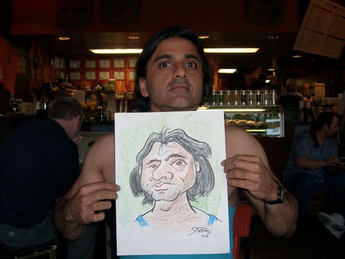
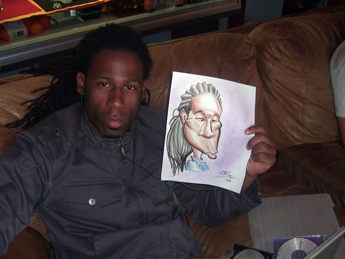
This dude didnt even know i was drawing him, i wasn't even expecting it to come out the way I envisioned it, but it did! this is probably my most favorite sketch i've done yet... and i did it on crappy 8x11 printer paper. i still need to get darker and more confident with my coloring though, im too slow with it. and his hair is bleah. but overall, im happy with it.
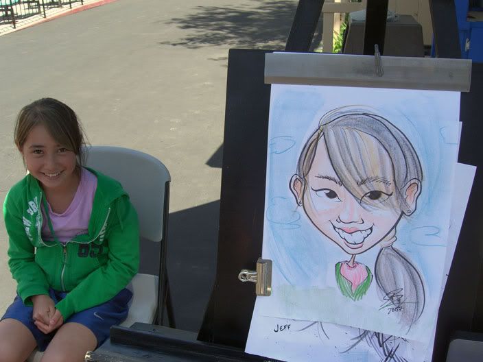
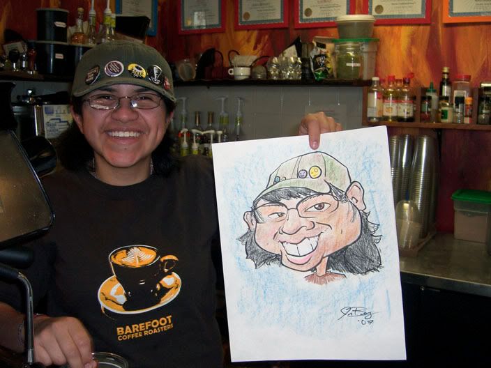
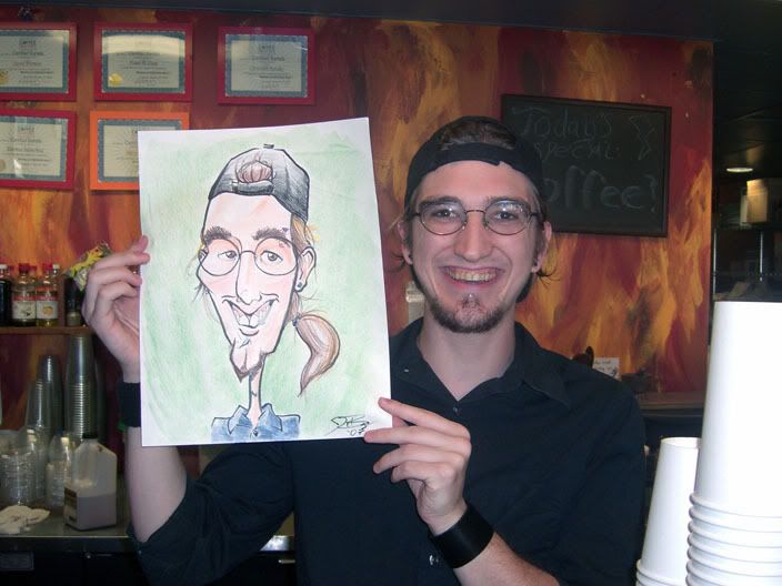
I would consider this to be my second best to date. again, bleah hair, need to go darker with the skin tones. His cheek bone seems a little too high or to far out and line work is still mediocre at best. but i think i got a good likeliness overall. speed was wayyyyy too slow on this one though.
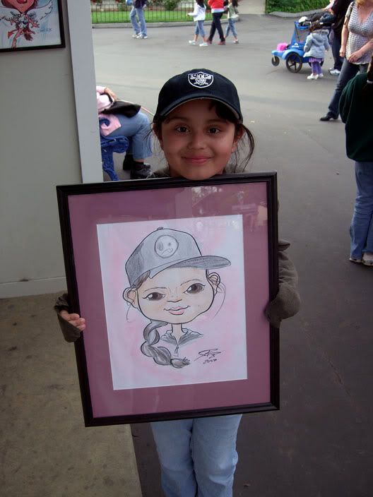
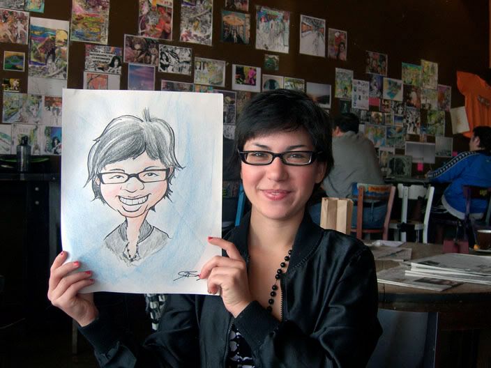
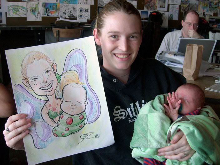
I were to change just one thing on this one, it would be the eyes. next would be the face shape. The face shape makes her look like a baby, but the eyes just look plain boring to me. her nose should be wider too, but still, you can tell it's her.
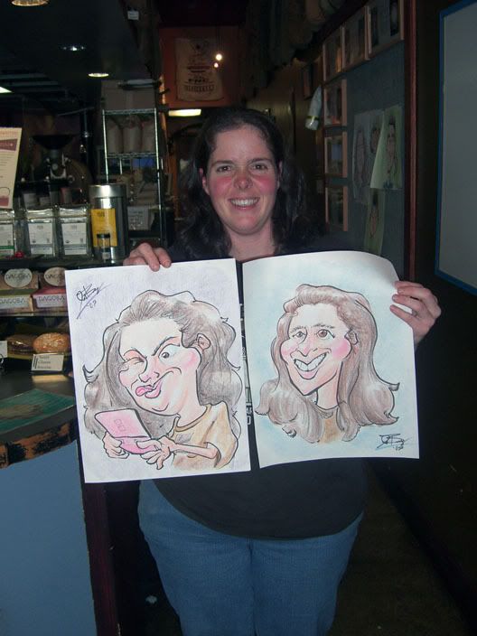
Now these were just... well... i failed in my opinion. everyone liked them both, and i'd say i like the one where she is playing the DS more, but likeliness is way down. I know what i want to look for but i couldn't translate it to drawing. the one on the right was my first attempt and what totally blew it was the face shape. her face isn't long or angular, its more oval with a boxy top. her nose is what really sticks out, like it reminds me of a whistle... i dunno why. What i DO like about the 2nd attempt (left one) was how cartoony and fun i tried to make it look. It shows some character and has exaggeration going on. I need to incorporate more personality into my drawings, so they don't look so plain and generic.
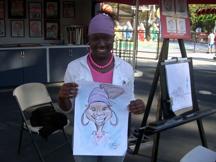
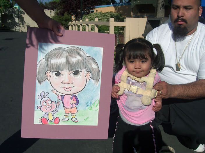
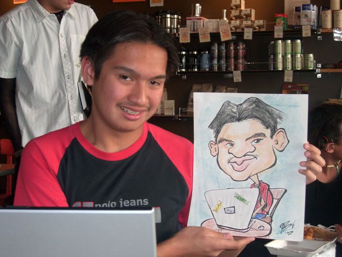
Likeliness is there, unfortunately he never smiled until AFTER i gave him the drawing... i wanted to draw his braces. color is crap (need to go darker), and so is the line work.
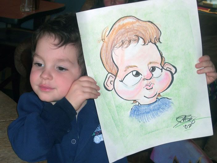
I like this one as far as giving it some character. The cross eyes make it look funnier. the hair is bad though, and so is teh coloring on it. but i started to go darker with the color on his face, just need to push it a little more. line work is so so... the dad liked it so much, he tipped me 9 bucks when it was free to begin with!
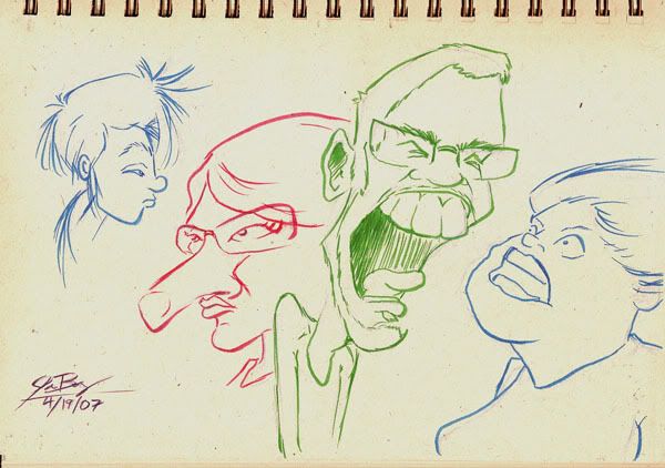
i was hoping to post some figure stuff but honestly... the drawings were 2 steps backwards from what i've been doing lately, thats what i get for missing a drawing salon session. alright... back to attempting to progress forward.

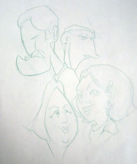
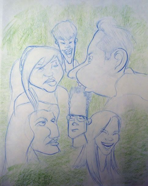
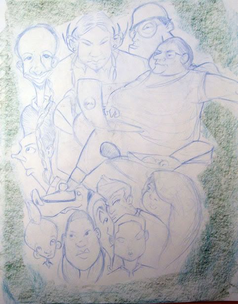
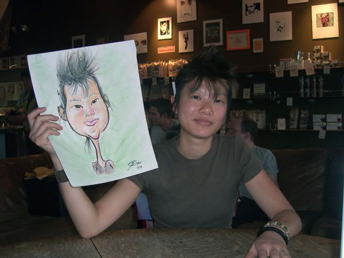
 I really like the sketch of girl in the upper left corner.
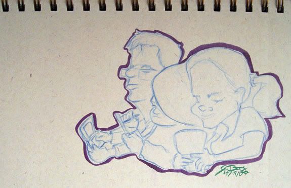 These peeps were playing their Nintendo DS s..ss...s? Funny, more girls playing games than guys. This coffee shop rocks. =D